At FDRY, our London-based Fulham, Victoria and Chelsea team of specialist web designers and web developers deliver world-class e-commerce web design services that help ambitious British brands dominate their niches.
We combine stunning, brand-unique visual design with bulletproof technical development to create bespoke online stores on WooCommerce, Shopify, WordPress, Adobe Commerce (Magento), and BigCommerce.
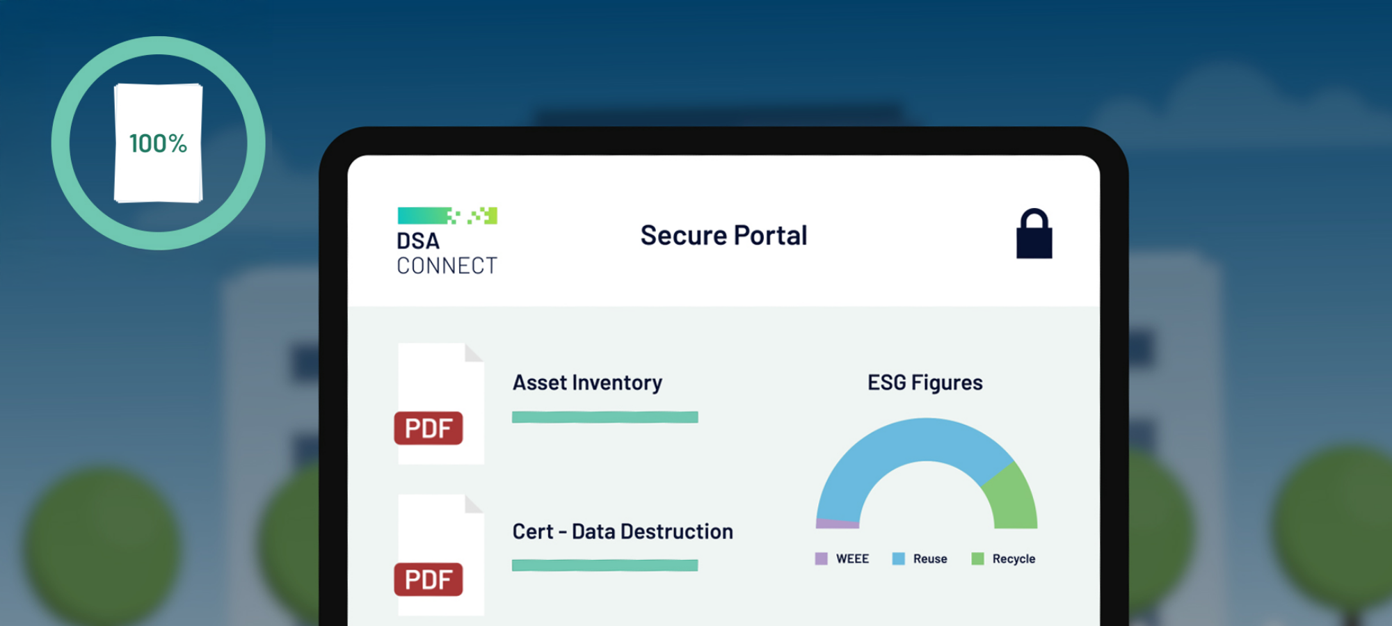
Our web designers craft pixel-perfect, mobile-first experiences that showcase your products beautifully and guide users seamlessly to checkout, while our senior web developers build custom functionality, flawless integrations with payment gateways, CRM systems, and inventory tools, and performance that consistently achieves sub-2-second load times and 98–100 Core Web Vitals scores.
From high-volume D2C brands to complex B2B marketplaces, FDRY’s e-commerce web designers and web developers have driven 300 %+ revenue increases for clients across the UK. We handle everything—strategy, design, development, launch, and ongoing conversion rate optimisation, so you get a future-proof store that grows with your business.
Ready to scale your online store without the growing pains? As a specialist ecommerce development agency based in Chelsea and Victoria, London, we’re the ecommerce replatforming partner and ecommerce optimization agency that small-to-enterprise brands trust when revenue (not just traffic) is the goal.
Contact us today for a zero-obligation custom ecommerce development quote and discover why London’s fastest-growing brands choose us as their long-term ecommerce replatforming partner. Your checkout page deserves better – let’s make it happen.
Need a digital marketing agency that actually moves the needle instead of just sending pretty reports? We’re a Chelsea/Victoria-based full-service marketing agency obsessed with predictable, scalable growth for B2B and [Industry, e.g., SaaS] companies — from enterprise-grade SEO that dominates page one to hyper-targeted PPC campaigns that lower CAC and fill pipelines fast.
No fluffy “awareness” packages here. Our digital marketing retainer services are built around your revenue goals, with transparent full-service marketing agency pricing and fixed-fee digital marketing agency cost quotes you’ll never need to second-guess. Whether you’re an enterprise hunting for a battle-tested SEO company for enterprise, a SaaS founder needing a marketing consultant who speaks pipeline (not vanity metrics), or a B2B brand ready to outspend and outsmart competitors, we become the embedded growth partner you wish you hired years ago.
Book a no-pressure PPC agency appointment or request your custom digital marketing agency cost quote today. Let’s turn your ad spend and organic traffic into revenue you can take to the bank.
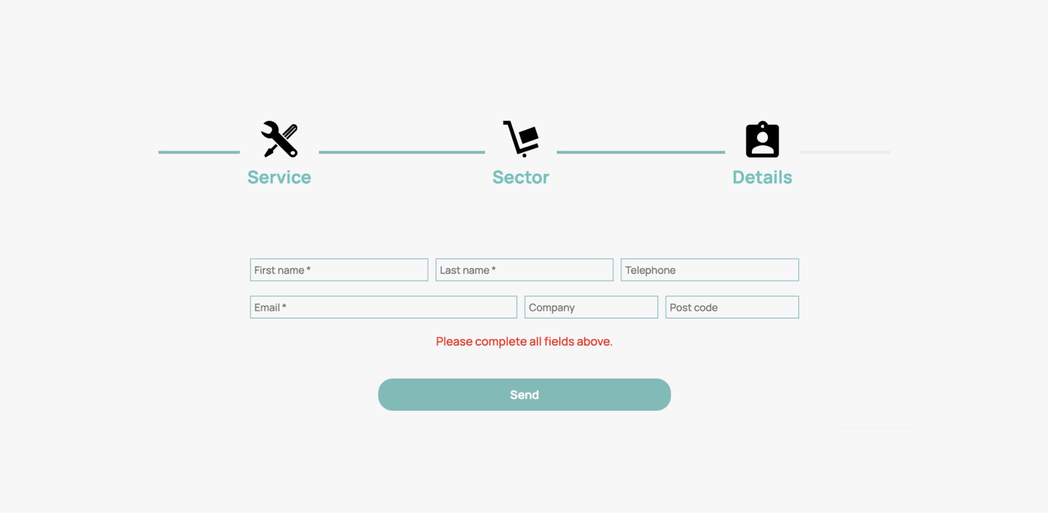
Ready for an e-commerce website that finally delivers the sales you deserve? Partner with FDRY’s expert web designers and web developers today.